The Challenge
Restore user trust
Principal, an American global financial investment management and insurance company, had a cultural barrier in Mexico: decades of government distrust had shaped how people viewed retirement. Most customers believed their Afore savings were tied to the government, possibly inaccessible, and risky to manage without an in-person representative. Digital tools weren’t just unfamiliar — they felt unsafe.
Principal saw the impact. Customers rarely invested unless an advisor guided them. Yet they wanted to shift more activity to digital channels. Competitors were modernizing, and the move to mobile-first experiences was redefining expectations. We helped shift the question from, “How do we build a deposit app?” to “How do we motivate people to invest at all?”
The Work
Here’s how we helped Principal Mexico
We began with the people behind the problem. Research revealed a deep misunderstanding of how retirement accounts worked and a cultural distrust that stopped customers from investing unless an advisor guided every step. Users didn’t just need a digital tool — they needed clarity, confidence, and a reason to believe their actions mattered.
Principal had asked for a simple deposit app. The evidence pointed to a different solution. We reframed the project around a single strategic idea: retirement planning motivates behavior in a way transactions never will.
This shift shaped the experience we ultimately designed — a modern web-based retirement planner that helped customers see a secure future, understand the impact of their decisions, and make changes independently. Below is the narrative arc of that solution, with natural placements for screenshots.
What we learned:
- Most users didn’t understand that their Afore savings were legally theirs.
- Retirement felt abstract and unreachable — not a goal worth planning for.
- People lacked financial literacy but were eager to learn when given simple, direct guidance.
- Motivation increased when users saw clear progress toward a personal goal.
- Early concepts of the planning tool gave users a sense of ownership they’d never felt before.
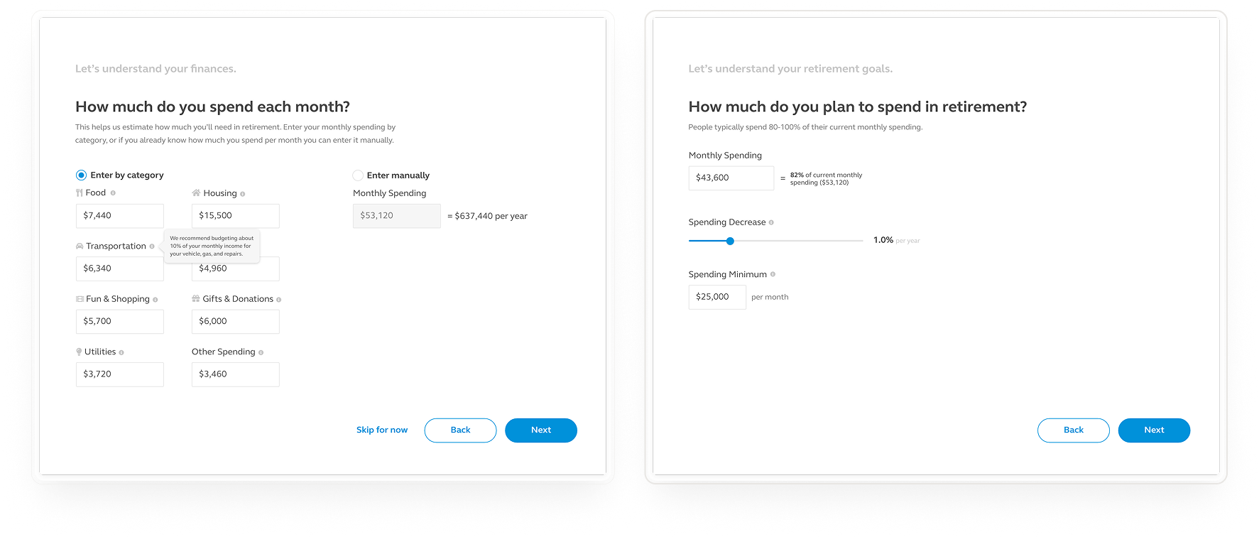
A clear picture of the user’s financial life
To give meaningful guidance, the system needed to understand each user’s real context — not just their Principal accounts. We designed an onboarding flow that collected key information in plain language, such as marital status and household structure, employment details, income and savings outside of Principal, budget estimates for users who didn’t already have one.
Each step explained why the information mattered and how it improved the quality of recommendations. Transparency was essential for rebuilding trust.
Education woven into the experience
Users weren’t just filling out forms; they were learning. We avoided financial jargon and used direct, conversational language that mirrored a trusted advisor. The interface taught users what their Afore account actually is, why their money is safe, how retirement accounts grow over time, and what “being on track” means. This wasn’t a separate education section — it was embedded in the flow, right where users needed it.
A holistic retirement plan they could see — and shape
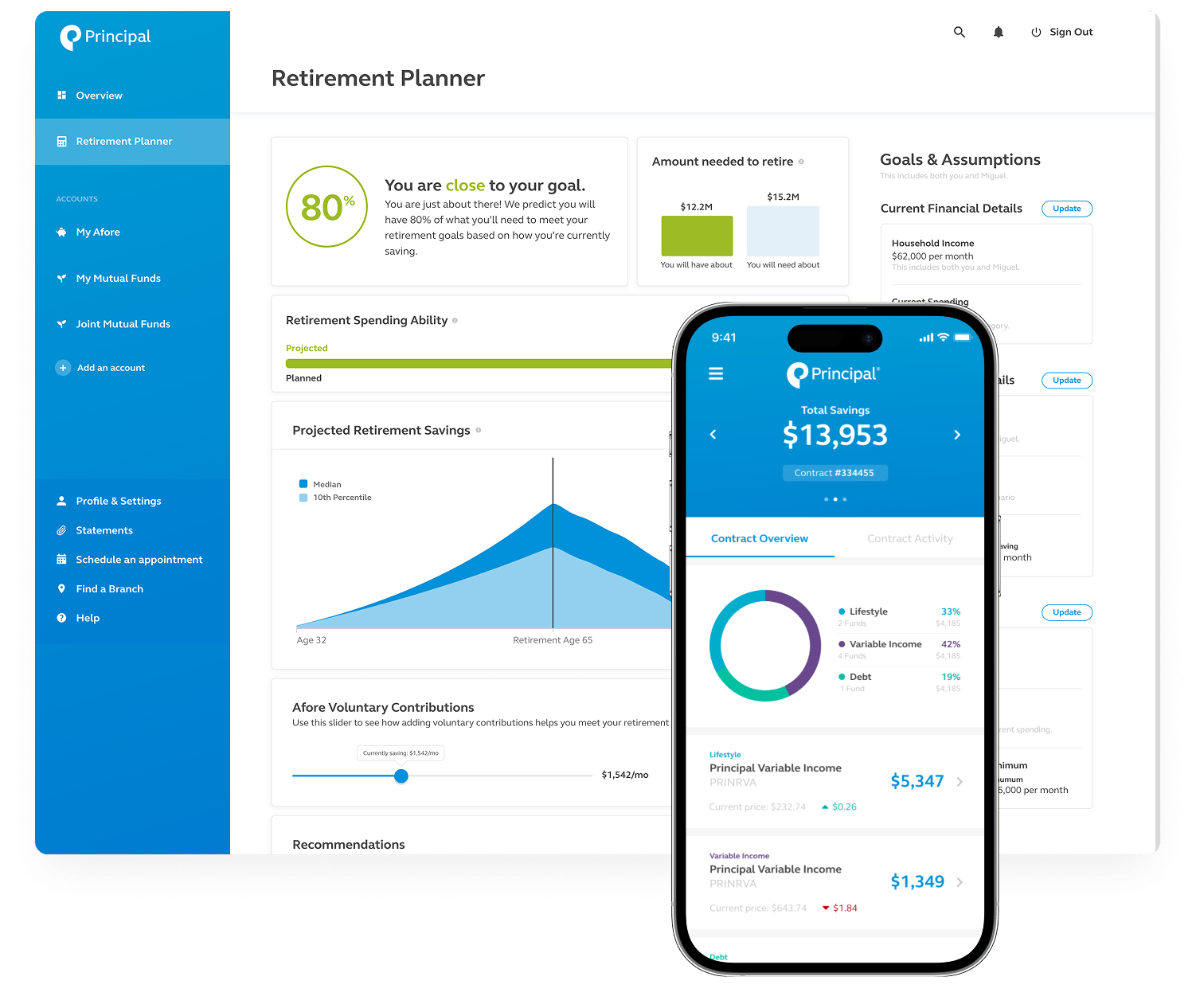
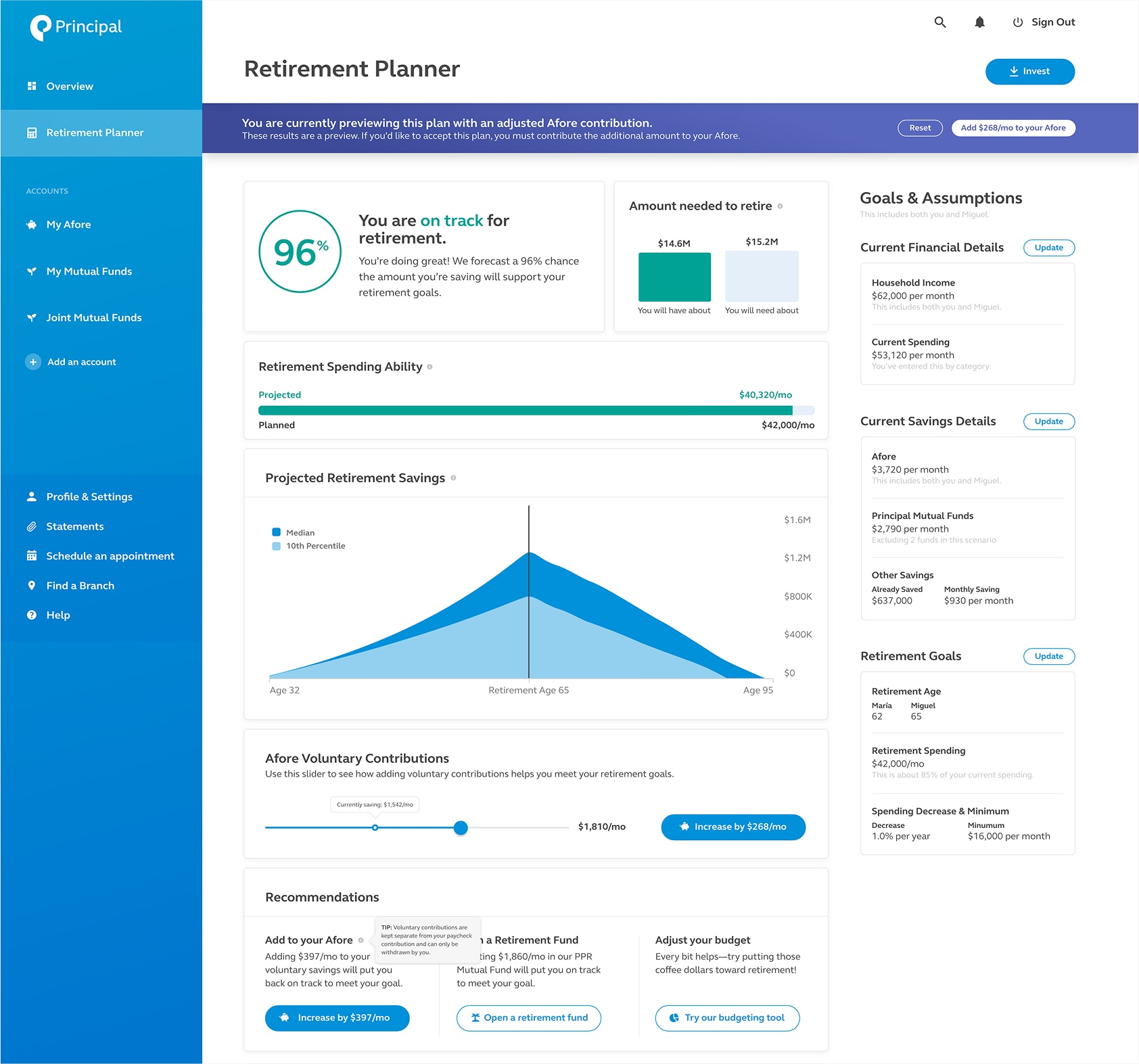
Once the system understood the user’s financial picture, it generated a personalized retirement projection. This became the emotional turning point for many users.
For the first time in a self-service way, customers could:
- See their projected retirement income
- Understand how close they were to their goal
- View progress indicators designed to build confidence (green even at 80%)
- Explore multiple scenarios without fear of making a mistake
This visual model transformed retirement from an abstract concept into something real and within reach.
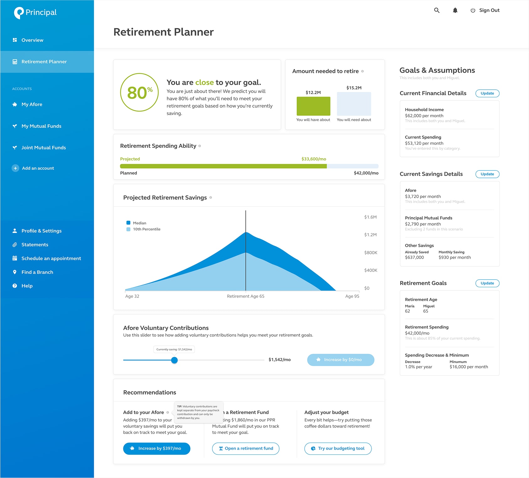
Scenario sliders that show impact before commitment
Users could adjust key levers and immediately preview the impact of voluntary contributions, additional mutual fund investments, retirement age, or monthly retirement expenses.
Scenario modeling was critical. It gave users a safe environment to try, learn, adjust, and build confidence — something they previously relied on advisors for.
And when they were ready, a single action applied all their chosen changes.
A holistic investment overview that builds long-term trust
Beyond retirement planning, the platform provided a consolidated view of all Principal accounts and external investments. The unified view reinforced the message: Your financial future is yours — understandable, manageable, and in your control.
A product strategy that reshaped the organization’s approach
Usability testing confirmed more than ease of use — it confirmed motivation. Users felt ownership for the first time. They understood their accounts. They saw why investing mattered. They trusted the experience because it spoke to them simply, clearly, and respectfully.
This shifted executive thinking from “better UI will increase deposits” to: trust + clarity + goal modeling = adoption.
The retirement planner became Principal Mexico’s modern strategy, not just a feature.
The Impact
A modern retirement strategy, not just a modern interface
Principal Mexico gained something bigger than a new set of tools — they gained a new product strategy. The work shifted their mindset from transactional UX to human-centered financial empowerment, a strategic move that positioned them competitively in a rapidly modernizing market.
Users responded with increased clarity and confidence. They understood their accounts, saw meaningful goals, and felt ownership of their future — something traditional advisor-led interactions had struggled to achieve at scale.
Most importantly, the solution tackled the real barrier: trust is earned through transparency, simplicity, and guidance — not through more features.

