
The Challenge
A system built around Salesforce — not around giving
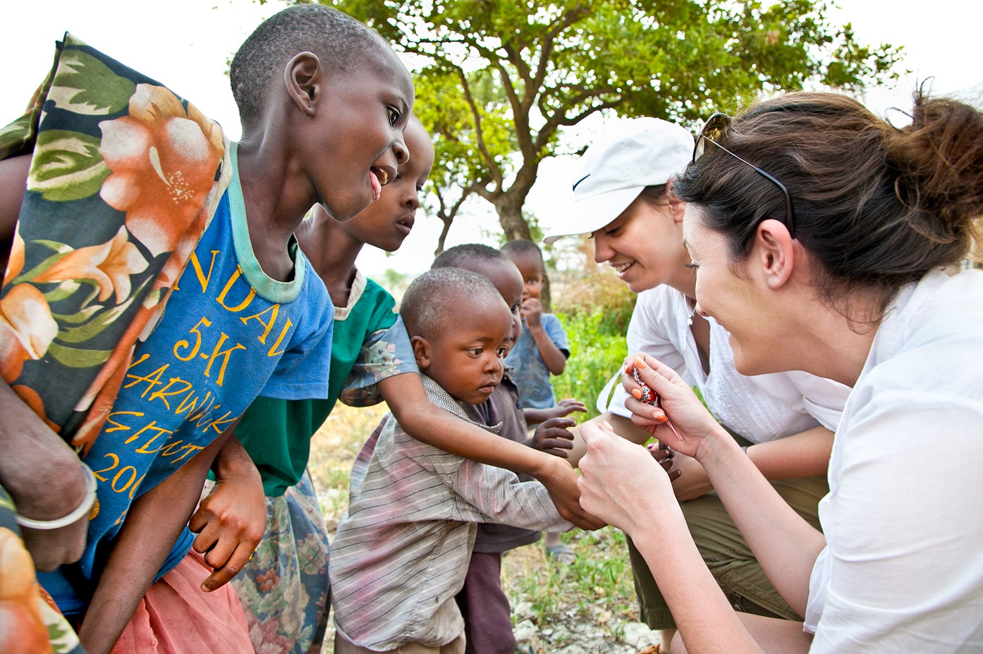
Founded in 1952, Compassion International has always fought for one thing: reducing child poverty. It grew from supporting South Korean orphans during the Korean war to serving millions worldwide, becoming a major nonprofit focused on long-term child development — providing nutritious food, medical care, protection, and hope.
Compassion’s staff cares deeply about their mission, but it was being hindered by internal systems. A set of four disconnected tools forced team members to jump between tabs, interpret cryptic codes, and reconstruct account histories by hand. In many cases, up to nine people touched a single issue, increasing error risk and slowing down support.
The primary CRM tool reflected the limitations of its underlying platforms, not the mental models of the people who used it — and certainly not the needs of the children at the heart of Compassion’s mission.
This didn’t just impact internal efficiency. It reduced clarity during supporter calls, extended training time, and made even seasoned staff feel unsure of next steps.
Our redesign challenge came with clearly set goals:
- Cut exception processing time by 50%
- Reduce hand-offs and increase first-touch resolution
- Expand who can accurately complete transactions, by reducing training time
- Improve supporter satisfaction by 10%
- Create a workforce experience people are delighted to use
The Work
Here’s how we helped Compassion
We partnered with stakeholders from across the business, and engaged the actual internal employees performing the work. Over a period of 6 months, we rebuilt the experience around the people doing the work — and the children they support.
Key UX activities:
- UX Research
- Information Architecture
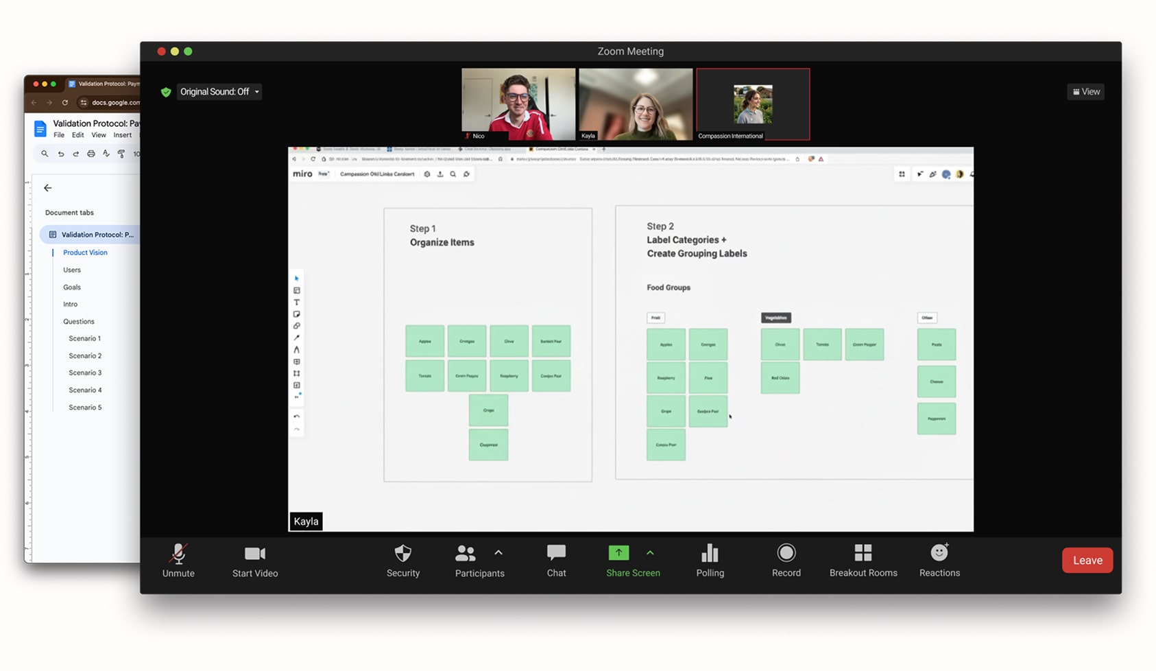
- Card Sorting
- Workflow Optimization
- UX Design
- Personas
- Concept Validation
- Usability Testing
- Product Strategy
Establishing a shared understanding: what’s wrong with our current system?
Across 37 staff members, the current system scored a 52 (D) System Usability Score — bottom 15th percentile. Learnability was the biggest concern, and what was most shocking? The worst scores were pervasive for long-tenured staff, a stark contrast from what we typically find in low learnability systems.
Users described their current experience as:
“…time-consuming, confusing, inconsistent, and frustrating…”
 Compassion Employee Quote from Initial Interviews
To dive deep into the workflows and experiences of everyday employees, we engaged in key activities that surfaced core issues and reinforced patterns already observed by Compassion teams. They were:
A comprehensive system map — showing how supporter, child, sponsorship, financials, and communication data interacted between systems.
Proto-personas — that revealed major differences in skills, tolerances, and mental models between call center and processing staff.
Journey maps — that showed unnecessary hand-offs, demonstrated high cognitive load processes and identified opportunities for solutions.
Crucially, our research showed:
System First Approach
Staff workflows instinctively started with the child first — but the system didn’t support that.
Poor Learnability
Newer staff couldn’t form mental models because the interface mirrored back-end system structure rather than human logic.
Recall Reliance
People relied on shorthand notes, memory, and “the person who knows” because the system wasn’t designed to help them reason through work.
“It was clear, that the first step would be re-framing the system around what staff naturally prioritized: the child, the supporter, and the relationship between them.”
 Kayla Byington Director of UX Engagement @ Visual Logic
A new information architecture that centers the child
Informed by research; validated in testing, we created a new system that leveraged a dual-hub-and-spoke framework with:
Each hub surfaces the most important information and actions — all sponsorships, donations, communications, and history — organized around the child or supporter, not the platform.
It moved Compassion away from the typical Salesforce-first structure into something that matched how staff think, talk, and prioritize during calls.
By pulling child-related decisions into a single, contextual place, staff could act confidently — and faster.
Concept validation and usability testing showed unmistakable improvements
Across three rounds of structured validation sessions, users responded with enthusiasm:
Novice users completed tasks normally handled by specialists
Experienced reps described the new experience as “clearer,” “easier,” and “much easier than what we do today.”
Quantitatively, concepts scored extremely well:
Task Completion Ratings (TCR): up to 99% (A) in some flows (e.g., donations, sponsorship).
Single Ease Question (SEQ): many tasks scoring A-level ease across Work List, Payment, and Child flows.
One quote captured the sentiment perfectly:
“Oh my gosh, this makes me want to work here.”
Compassion Employee Quote from Concept Validation
The Impact
A system that lets staff work with confidence — and follows the mental model of those using it
Compassion now has an experience engineered to reduce operational cost, increase clarity, and support its mission:
- Exception processing time drops because staff can resolve more work on the first touch
- Training time shrinks thanks to a structure that teaches itself
- Supporter interactions improve because staff finally see the right context at the right time
- Hand-offs decrease as workflow clarity empowers more users to act independently
- The system reinforces Compassion’s purpose — lifting children and families out of poverty through sustained, meaningful connection
This redesign didn’t just clean up workflows. It re-aligned the system with the mission, making children the structural center of every action.
The clearer the system, the stronger the support. And at Compassion, that clarity changes lives.

