
The Challenge
Put them to the test
Hy-Vee, founded in West Des Moines, Iowa, in 1930, is known for its high-quality food products and exceptional service. The supermarket chain operates more than 500 business units across the Midwest and was named the No. 1 Grocery Store in America by USA TODAY in the 2024 10Best Readers’ Choice Awards. With a workforce of more than 75,000, the company proudly delivers on its promise of providing “A Helpful Smile in Every Aisle” every day.
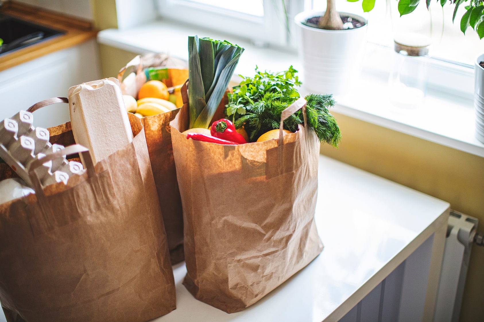
Hy-Vee has competed in the online grocery space since 2015, but demand surged during COVID, prompting the company to sharpen its competitive edge. They began by taking a closer look at themselves—their digital grocery shopping platform, Aisles Online, had never undergone formal usability testing. To change that, they partnered with us to evaluate the experience with real grocery shoppers.
The Work
Here’s how we helped Hy-Vee
Key activities:
Tested 23 participants on mobile and desktop
Evaluated the participants on 13 unique tasks
Outlined the complete user journey
Provided nearly 50 pages of insights and recommendations
50% of participants had previously tried or used a competing grocery app. Seventy-five percent were female, and roughly a quarter were over the age of 45. Among the participants, we recognized three distinct shopping motivations.
Driven by Deals
This shopper is driven by deals—sales, ads, and coupons guide every choice. They’re the type to say, “If it’s 3 for $3, I’ll buy all three and figure out what to make later.”
Driven by Brand
This shopper is brand-loyal, choosing their favorites no matter the price. They’re the one who insists, “Heinz is the only type of ketchup.”
Driven by Lists
This shopper sticks closely to their list, often seeking the lowest-cost options and rarely straying from the plan. They’ll say, “If it’s not on the list, it’s not going in my cart.”
We found that easy doesn’t always mean loved
After analyzing the results, we found the Task Completion Rate (TCR)—a score judged by facilitators—was above 90%. Unfortunately, the System Usability Scale (SUS), Net Promoter Score (NPS), and Single Ease Question (SEQ) told a different story. Younger users in particular showed the highest TCR but the lowest NPS—suggesting that while the system was usable, confidence in it and willingness to recommend it were low. Something wasn’t adding up.
This gap pointed to a mismatch between how users expected the system to work and how it actually behaved—a classic case of the “user model” clashing with the “design model.” This often leads to user frustration and abandonment of the task. In other cases model problems give people surprise and disappointment later, when the result isn’t what they thought. Some had even abandoned Aisles Online in favor of the more desirable experiences of the competitors.
Overall, shoppers were able to complete their tasks—usability wasn’t the issue. The problems we saw were rooted in expectations and perceptions.
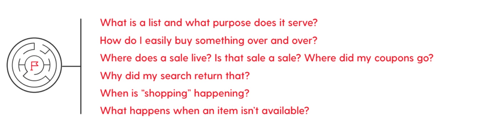
Where was the disconnect?
We uncovered a handful of “model” challenges the system needed to address, some more easily rectified than others.
We helped the team:
Shoppers approach lists in different ways: some start with broad ideas like “bread, milk, eggs” and decide on specifics as they shop; others keep a separate set of exact items to streamline the trip; and some store everything in their cart, adding between trips and checking out quickly. Aisles Online tried to accommodate all of these approaches in their “list feature” — but in doing so, it often left shoppers confused. Was the item in my cart or no longer needed?
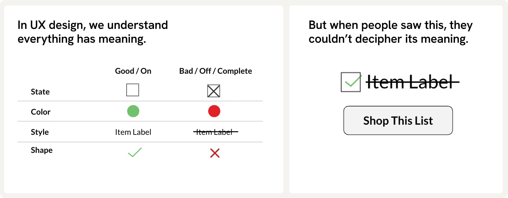
“That is either 100% right or 100% wrong, what I just did. But I just am not convinced which one… I feel like it gives me mixed messages there… I felt like it was both things.”
 Usability Test Participant
Hy-Vee had built their brand on the customer experience; unfortunately, the in-store experience wasn’t carrying over to Aisles Online. Users expressed clear frustration with the post-submit experience—citing unfriendly interactions, crowded pickup areas, and poor substitution choices—resulting in noticeable dissatisfaction.
Meanwhile, Walmart—known more for low cost than high service—was outperforming in digital grocery shopping. Their ability to exceed expectations had generated real enthusiasm. We believed Hy-Vee lacked similar momentum because Aisles Online doesn’t live up to the superior in-store experience customers expected. This gap was likely a major driver of the declining NPS score.
“I want them to do substitutions because If I’m doing an online order I want to make it as convenient as possible. When Wal-Mart does a substitution I often get a better deal. They will upgrade the size but for the same price.”
Usability Test Participant
The Impact
Low-cost, high-impact solutions based on real insights
In the end, our work delivered more than a list of problems—it gave the team a clear path forward. We provided a comprehensive report that broke down each model challenge and offered focused recommendations for improvement, along with more than ten quick wins designed to be low-cost yet high-impact for users. With detailed, data-backed insights in hand, the team finally had the ammunition they needed to move with confidence and intention. The guesswork was gone.
Instead of chasing new features or reinventing their systems, they could now refine and elevate what was already working—putting them on track to close competitive gaps without unnecessary complexity. Just as importantly, our research reinforced a crucial truth: shoppers choose Hy-Vee for the experience. That meant doubling down on what makes that experience special—finding new ways to deliver the helpful, human touch customers expect, especially during grocery pickup. With clarity, direction, and renewed focus, the team was equipped to build a future that honors what users value most.

